
import pandas as pd
import numpy as np
import networkx as nx
import matplotlib.pyplot as plt
from random import randintfacebook = pd.read_csv(
"data/facebook_combined.txt.gz",
compression="gzip",
sep=" ",
names=["start_node", "end_node"],
)
G = nx.from_pandas_edgelist(facebook, "start_node", "end_node")fig, ax = plt.subplots(figsize=(15, 9))
ax.axis("off")
plot_options = {"node_size": 10, "with_labels": False, "width": 0.15}
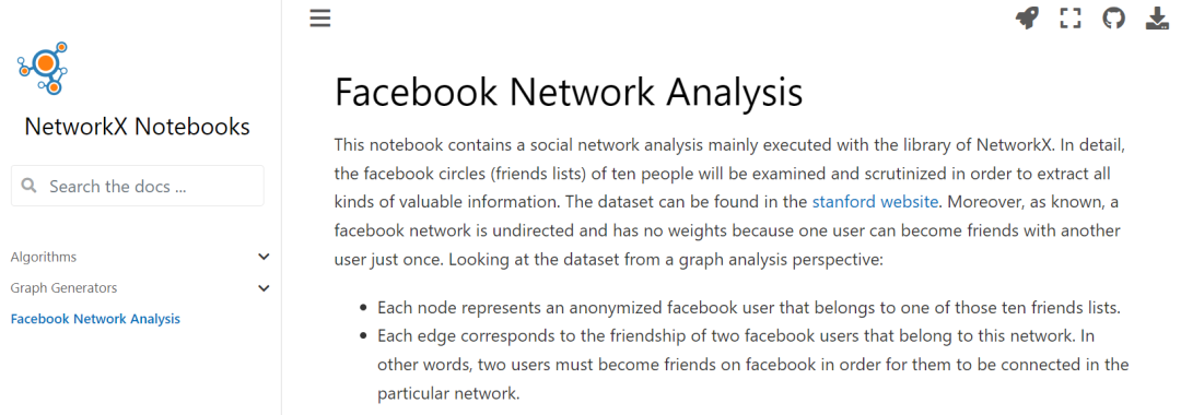
nx.draw_networkx(G, pos=nx.random_layout(G), ax=ax, **plot_options)pos = nx.spring_layout(G, iterations=15, seed=1721)
fig, ax = plt.subplots(figsize=(15, 9))
ax.axis("off")
nx.draw_networkx(G, pos=pos, ax=ax, **plot_options)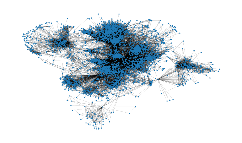
G.number_of_nodes()
4039
# 连边数量
G.number_of_edges()
88234
np.mean([d for _, d in G.degree()])
43.69101262688784
shortest_path_lengths = dict(nx.all_pairs_shortest_path_length(G))
# Length of shortest path between nodes 0 and 42
shortest_path_lengths[0][42]
1
diameter = max(nx.eccentricity(G, sp=shortest_path_lengths).values())
diameter
8
# Compute the average shortest path length for each node
average_path_lengths = [
    np.mean(list(spl.values())) for spl in shortest_path_lengths.values()
]
# The average over all nodes
np.mean(average_path_lengths)
3.691592636562027# We know the maximum shortest path length (the diameter), so create an array
# to store values from 0 up to (and including) diameter
path_lengths = np.zeros(diameter + 1, dtype=int)
# Extract the frequency of shortest path lengths between two nodes
for pls in shortest_path_lengths.values():
pl, cnts = np.unique(list(pls.values()), return_counts=True)
path_lengths[pl] += cnts
# Express frequency distribution as a percentage (ignoring path lengths of 0)
freq_percent = 100 * path_lengths[1:] / path_lengths[1:].sum()
# Plot the frequency distribution (ignoring path lengths of 0) as a percentage
fig, ax = plt.subplots(figsize=(15, 8))
ax.bar(np.arange(1, diameter + 1), height=freq_percent)
ax.set_title(
"Distribution of shortest path length in G", fontdict={"size": 35}, loc="center"
)
ax.set_xlabel("Shortest Path Length", fontdict={"size": 22})
ax.set_ylabel("Frequency (%)", fontdict={"size": 22})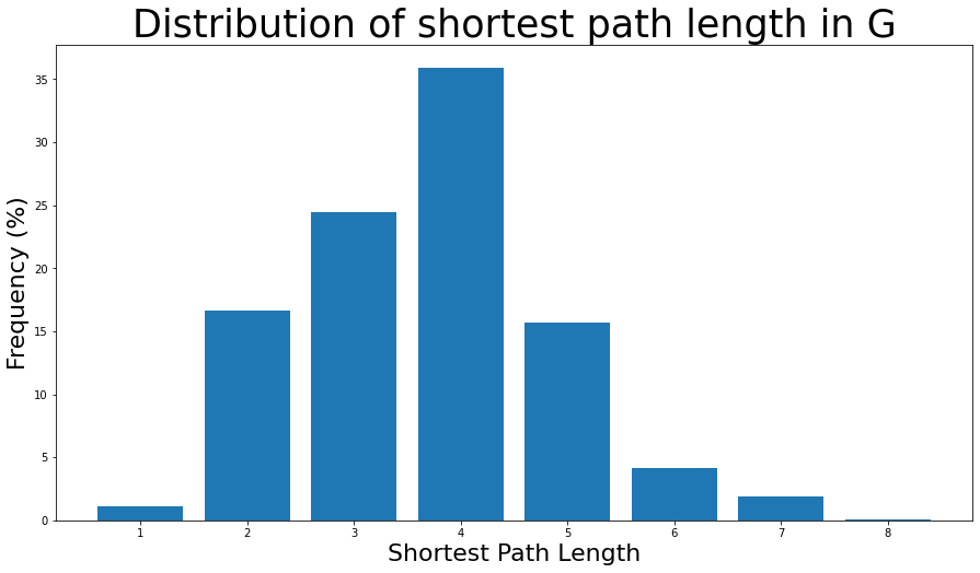
nx.density(G)
0.010819963503439287
nx.number_connected_components(G)
1degree_centrality = nx.centrality.degree_centrality(G)
# save results in a variable to use again
(sorted(degree_centrality.items(), key=lambda item: item[1], reverse=True))[:8]
[(107, 0.258791480931154),
(1684, 0.1961367013372957),
(1912, 0.18697374938088163),
(3437, 0.13546310054482416),
(0, 0.08593363051015354),
(2543, 0.07280832095096582),
(2347, 0.07206537890044576),
(1888, 0.0629024269440317)](sorted(G.degree, key=lambda item: item[1], reverse=True))[:8]
[(107, 1045),
(1684, 792),
(1912, 755),
(3437, 547),
(0, 347),
(2543, 294),
(2347, 291),
(1888, 254)]plt.figure(figsize=(15, 8))
plt.hist(degree_centrality.values(), bins=25)
plt.xticks(ticks=[0, 0.025, 0.05, 0.1, 0.15, 0.2]) # set the x axis ticks
plt.title("Degree Centrality Histogram ", fontdict={"size": 35}, loc="center")
plt.xlabel("Degree Centrality", fontdict={"size": 20})
plt.ylabel("Counts", fontdict={"size": 20})
node_size = [
    v * 1000 for v in degree_centrality.values()
]  # set up nodes size for a nice graph representation
plt.figure(figsize=(15, 8))
nx.draw_networkx(G, pos=pos, node_size=node_size, with_labels=False, width=0.15)
plt.axis("off")
betweenness_centrality = nx.centrality.betweenness_centrality(
    G
)  # save results in a variable to use again
(sorted(betweenness_centrality.items(), key=lambda item: item[1], reverse=True))[:8]

[(107, 0.4805180785560152),
 (1684, 0.3377974497301992),
 (3437, 0.23611535735892905),
 (1912, 0.2292953395868782),
 (1085, 0.14901509211665306),
 (0, 0.14630592147442917),
 (698, 0.11533045020560802), (567, 0.09631033121856215)]
plt.figure(figsize=(15, 8))
plt.hist(betweenness_centrality.values(), bins=100)
plt.xticks(ticks=[0, 0.02, 0.1, 0.2, 0.3, 0.4, 0.5])  # set the x axis ticks
plt.title("Betweenness Centrality Histogram ", fontdict={"size": 35}, loc="center")
plt.xlabel("Betweenness Centrality", fontdict={"size": 20})
plt.ylabel("Counts", fontdict={"size": 20})
node_size = [
    v * 1200 for v in betweenness_centrality.values()
]  # set up nodes size for a nice graph representation
plt.figure(figsize=(15, 8))
nx.draw_networkx(G, pos=pos, node_size=node_size, with_labels=False, width=0.15)
plt.axis("off")
closeness_centrality = nx.centrality.closeness_centrality(
    G
)  # save results in a variable to use again
(sorted(closeness_centrality.items(), key=lambda item: item[1], reverse=True))[:8]

[(107, 0.45969945355191255),
 (58, 0.3974018305284913),
 (428, 0.3948371956585509),
 (563, 0.3939127889961955),
 (1684, 0.39360561458231796),
 (171, 0.37049270575282134),
 (348, 0.36991572004397216),
 (483, 0.3698479575013739)]
# 此外,一个特定节点v到任何其他节点的平均距离也可以很容易地用公式求出:1 / closeness_centrality[107]
2.1753343239227343
plt.figure(figsize=(15, 8))
plt.hist(closeness_centrality.values(), bins=60)
plt.title("Closeness Centrality Histogram ", fontdict={"size": 35}, loc="center")
plt.xlabel("Closeness Centrality", fontdict={"size": 20})
plt.ylabel("Counts", fontdict={"size": 20})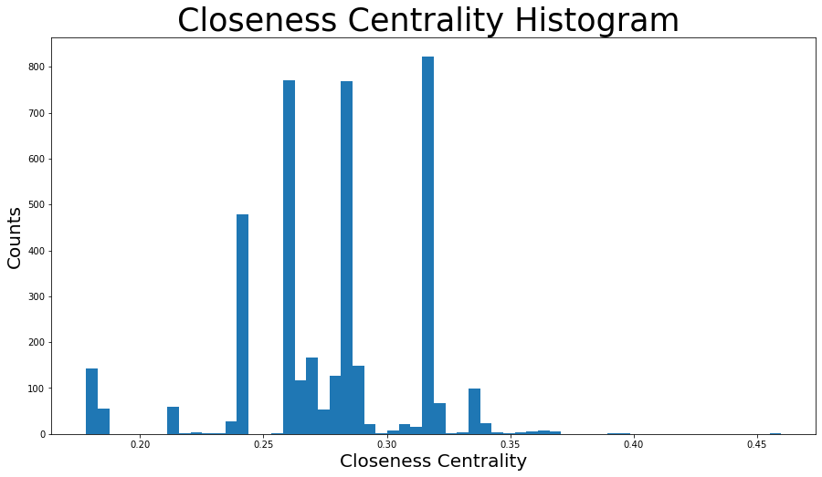
node_size = [
    v * 50 for v in closeness_centrality.values()
]  # set up nodes size for a nice graph representation
plt.figure(figsize=(15, 8))
nx.draw_networkx(G, pos=pos, node_size=node_size, with_labels=False, width=0.15)
plt.axis("off")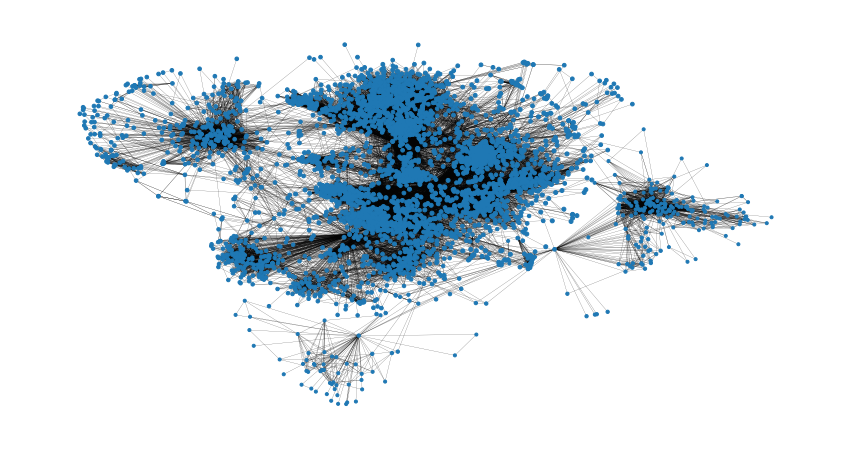
以及特征向量中心性等中心性指标,用类似的方式即
可获取上述图表。
nx.average_clustering(G)
0.6055467186200876

plt.figure(figsize=(15, 8))
plt.hist(nx.clustering(G).values(), bins=50)
plt.title("Clustering Coefficient Histogram ", fontdict={"size": 35}, loc="center")
plt.xlabel("Clustering Coefficient", fontdict={"size": 20})
plzt.ylabel("Counts", fontdict={"size": 20})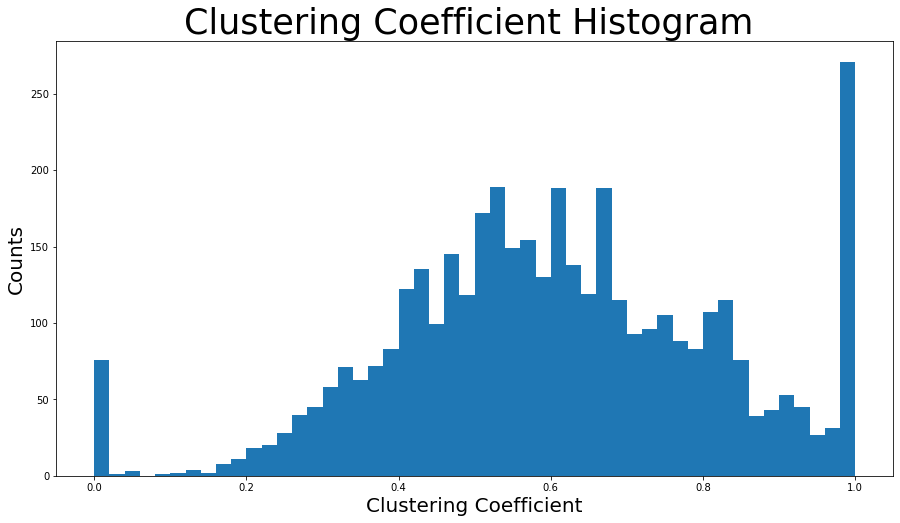
nx.has_bridges(G)
True
# 输出桥的数量
bridges = list(nx.bridges(G))
len(bridges)
75
plt.figure(figsize=(15, 8))
nx.draw_networkx(G, pos=pos, node_size=10, with_labels=False, width=0.15)
nx.draw_networkx_edges(
G, pos, edgelist=local_bridges, width=0.5, edge_color="lawngreen"
) # green color for local bridges
nx.draw_networkx_edges(
G, pos, edgelist=bridges, width=0.5, edge_color="r"
) # red color for bridges
plt.axis("off")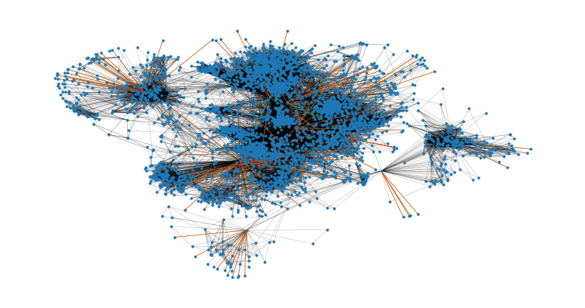
nx.degree_assortativity_coefficient(G)
0.06357722918564943
nx.degree_pearson_correlation_coefficient(G)
0.06357722918564918
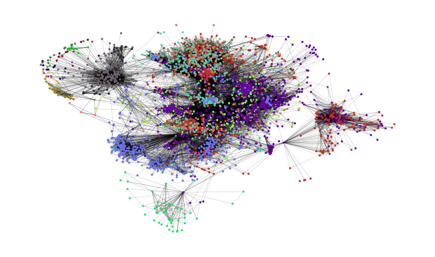
colors = ["" for x in range(G.number_of_nodes())]  # initialize colors list
counter = 0
for com in nx.community.label_propagation_communities(G):
    color = "#%06X" % randint(0, 0xFFFFFF)  # creates random RGB color
    counter += 1
    for node in list(
        com
    ):  # fill colors list with the particular color for the community nodes
        colors[node] = color
counter
44
plt.figure(figsize=(15, 9))
plt.axis("off")
nx.draw_networkx(
    G, pos=pos, node_size=10, with_labels=False, width=0.15, node_color=colors
)
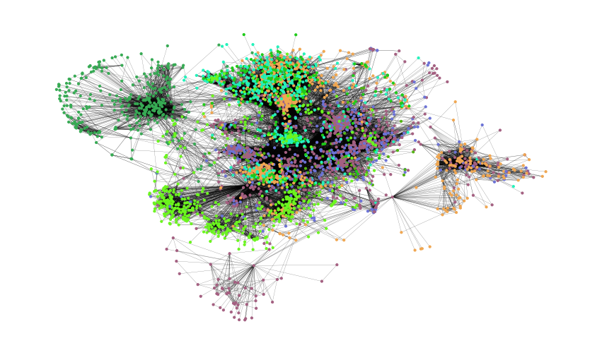
colors = ["" for x in range(G.number_of_nodes())]
for com in nx.community.asyn_fluidc(G, 8, seed=0):
    color = "#%06X" % randint(0, 0xFFFFFF)  # creates random RGB color
    for node in list(com):
        colors[node] = color

plt.figure(figsize=(15, 9))
plt.axis("off")
nx.draw_networkx(
    G, pos=pos, node_size=10, with_labels=False, width=0.15, node_color=colors
)
[1]https://networkx.org/nx-guides/content/exploratory_notebooks/facebook_notebook.html#id2
[2]http://snap.stanford.edu/data/ego-Facebook.html
内容中包含的图片若涉及版权问题,请及时与我们联系删除

评论
沙发等你来抢